
 XM
XM Bybit
Bybit Binance
 Robinhood
 Webull
 IC Markets
 Pepperstone
 OKX
OKX Vantage
 VT Markets
 BingX
BingX Gate.io
 Kucoin
 MEXC
MEXC Exness
 Bitget
What is a Dot Plot? Typically, the quarterly FOMC meetings (March, June, September, December) include the announcement of the Dot Plot chart. It is evident that this is a crucial term in the field of financial investment. Today, let’s explore all the relevant information about the Dot Plot with FOREX. Stay tuned for the full article below.
What is Dot Plot?
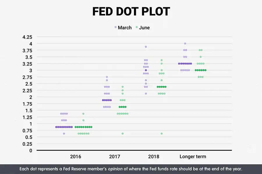
The Dot Plot chart consists of round dots (you can visualize it through the illustration above). The Dot Plot provides insight into the expectations of members of the Federal Open Market Committee (FOMC) regarding the Federal Reserve’s interest rates at a given point in time.
Through the Dot Plot, the market can anticipate whether FOMC members have a positive or negative outlook on the Fed’s interest rates. This chart informs consumers about how much each Fed official expects to pay for borrowing in the future (interest rates).
However, it is important to note that predicting future interest rates through the Dot Plot is similar to trying to guess lottery results, so caution is advised. Many experts, including members of the Fed itself, have questioned the predictive capability, accuracy, and reliability of this tool.
“If you focus too much on the dots in the Dot Plot, you may lose sight of the bigger picture,” Fed Chair Jerome Powell has mentioned in various remarks, most recently at the press conference announcing the Fed’s interest rate agreement on June 18-19.
For instance, the quarterly forecasts of officials regarding policy for 2019 and 2020 did not predict the Fed’s final course. Entering 2020, the U.S. central bank maintained its monetary policy stance. However, the U.S. economy later faced a severe crisis due to an unforeseen threat—the outbreak of a global pandemic.
The U.S. central bank cut interest rates at two emergency meetings within 13 days before the rapid spread of the pandemic. After the second emergency rate cut due to the Covid-19 outbreak, Governor Powell told reporters that making predictions “may create more confusion than clarity” because the future economic outlook remains uncertain.
While officials continue to provide forecasts, there is still a risk in taking them too seriously. Fed officials’ forecasts have never been binding commitments. Their actions depend on the recovery of the economy.
Nonetheless, Dot Plots remain a crucial part of the Fed’s communication process. If the U.S. central bank states that it does not plan to adjust interest rates for the next few years, this simply means it is willing to keep rates low.
Here’s what you need to know about the Dot Plot, including what it is, how to read it, and why you can consider it a reference tool when it is updated.
Guide to Understanding the Dot Plot Chart
The Dot Plot chart records Fed officials’ projections for the central bank’s key short-term interest rate. Currently, the interest rate remains within the target range of 0-0.25%, the lowest level since the Great Recession. Moving forward, Fed officials are expected to maintain interest rates to support economic recovery.
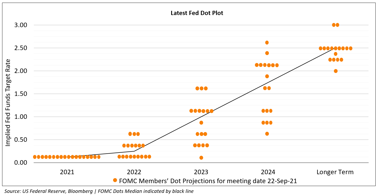
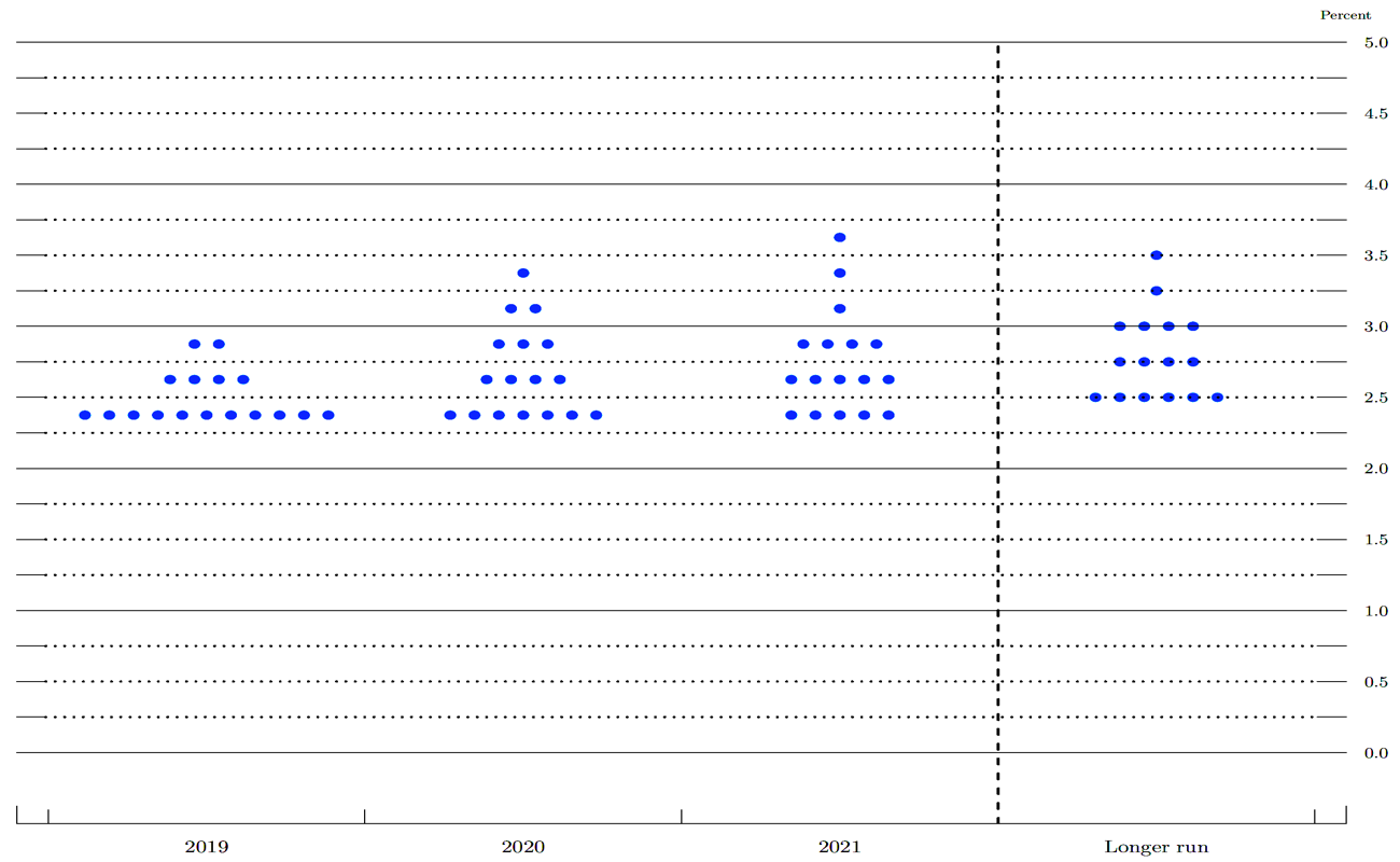
Each dot represents a Fed official, from Chair Jerome Powell to Governor Lael Brainard, as well as New York Fed President John Williams and St. Louis Fed President James Bullard. Of course, all information is confidential, so no one knows the exact owner of each dot.
These dots indicate what each U.S. central bank official believes to be the appropriate median lending rate by the end of each calendar year if the economy develops as expected. These officials also provide a dot projection for the next three years and a long-term estimate.
The Y-axis represents the interest rate levels, while the X-axis represents the year in which officials make their predictions.
![데이터경제] "내년 미국 등 글로벌 경기침체 가능성 높아졌다"...월가 분석가들](http://finance-solutes.com/wp-content/uploads/2025/02/587987_283143_4929.jpg)
By looking at the Dot Plot chart, we can identify the positioning of the dots. This allows us to determine where potential biases from the Fed may lie.
For example, since June 2020, most Fed officials expected to keep interest rates unchanged until 2022. However, one official supported a rate hike, pushing the average lending rate above 0.5%. In the long run, officials anticipated deposit interest rates to remain stable at 2.5% in the near future, as lending rates neither accelerate nor slow down economic growth. These projections could be adjusted when officials update their forecasts in June 2021.
This may sound complex, but consider this: if you have a savings account and are looking for high-interest returns, or if you have credit card debt or a loan tied to bank interest rates, the Dot Plot chart can help you anticipate interest rate trends for the next one or two years, based on the decisions of policymakers.
However, exercise caution when analyzing this chart. In the past, the Fed had pledged to keep interest rates stable, yet it later slashed them to record lows. This demonstrates that the Dot Plot cannot accurately predict the Fed’s policy direction.
How Is the Dot Plot Chart Created?
The Fed began using the Dot Plot in 2012, during a period when the economy was still recovering from a recession and interest rates remained near zero. The central bank aimed to provide Fed watchers with an early insight into officials’ views before making official policy decisions.
Ryan Sweet, Director of Real-Time Economics at Moody’s Analytics and head of the Monetary Policy Research Institute, stated that this was a form of “forward guidance,” a concept introduced by former Fed Chair Ben Bernanke. The goal was to prepare the market for potential interest rate changes in response to the Fed’s singular support efforts to sustain economic growth.
The usefulness of the Dot Plot became evident throughout the prolonged economic recovery following the financial crisis. The economy gradually rebounded, with the unemployment rate reaching its lowest level since 1969. This period of expansion became the longest on record since the 1800s. However, the economic dynamics differed from those before the 2008 global financial crisis.
One reason for the continued use of the Dot Plot was that the U.S. economy officially entered a recession following the Covid-19 pandemic. In this case, “forward guidance” was necessary to mitigate the risk of another crisis.
Nevertheless, the road ahead is increasingly unpredictable. This is largely due to the uncertain course of the pandemic. A second wave of infections could lead to widespread lockdowns across the country, while the introduction of vaccines could significantly alter the recovery process, providing the Fed with a stronger basis for future rate hikes.
Sarah House, director and senior economist at Wells Fargo, noted, “You have to remember that, in many ways, this is the baseline scenario for officials—if everything unfolds as they expect. However, this scenario could change very quickly.”
Should You Rely Heavily on the Dot Plot?
Fed officials have long emphasized that they will be “data-dependent” in determining when to raise interest rates after the global pandemic. This means that officials will not increase rates rapidly without sufficient justification—they will not follow a predetermined path for rate adjustments.
Below are some expert opinions on the predictive nature of the Dot Plot chart to give you a more comprehensive view of this tool:
- According to Ryan Sweet: “Since decisions mostly depend on economic data, the FED needs to be flexible based on the health of the economy… The Dot Plot chart is not a forecast. It is not a certainty. As the economy changes, financial markets change, interest rate forecasts change, and the Dot Plot charts are updated and change very quickly.”
- Julia Coronado, president and founder of Macro Policy Perspectives and a former board member of the FED, stated: “The uncertain economic landscape further reduces the predictive ability of the Dot Plot chart”… “During times of recession, SEP (Summaries of Economic Projections) becomes more unpredictable. With SEP, they do not provide a way to cope with unforeseen future changes.”
The dots in the Dot Plot chart can also be misunderstood or overlooked. Wall Street panicked in December after the FED issued a “hawkish” statement following the meeting, calling for “gradual increases and more to come,” and presented a Dot Plot chart outlining two hikes in 2019.
The 2019 meeting led to the worst December for U.S. stocks since the crisis, even though Powell emphasized that the FED’s policy decisions “do not follow a set path and will change if upcoming data changes significantly in a meaningful way.”
Will the Dot Plot chart be improved or removed?
At the FED’s January meeting, some officials raised concerns about the usefulness of the Dot Plot chart.
“Some participants expressed concerns that, in today’s unstable economic environment, policy rate forecasts as part of the summary of economic projections have not provided an accurate outlook on the Committee’s policy direction,” the meeting records stated.
The FED has reviewed its monetary policy framework and communication strategy before deciding whether to improve or eliminate the Dot Plot forecasting tool. However, this possibility remains uncertain. While Powell stated at the FED’s press conference that the Dot Plot chart could cause confusion, he also mentioned that the Dot Plot “could be a constructive element of transparency and comprehensiveness when disclosed to the media” if understood correctly.
According to Coronado: “Governors do not have voting rights, but they are heard. The Dot Plot chart also promotes institutional transparency and trust at a time when the FED’s decisions are strongly opposed by the President.” Keep doing what they are doing. The Dot Plot chart and SEP are elements of transparent policy.” “But that does not mean it is useful for the community or the market. It can cause confusion.”
Jonathan Wright, an economics professor at Johns Hopkins University, noted that the dots—typically 19, but currently 17 due to two vacant positions on the FED’s Board of Governors—could be more noise than a signal.
There is no information on how each leader forms their prediction, and only 12 members have voting rights in the Federal Open Market Committee (FOMC). Additionally, there is a missing dot in the FED’s long-term forecast because St. Louis FED President Jim Bullard has spoken out about omitting his projection.
He stated: “You might think that more information is better, but you have 19 people with different economic models simultaneously submitting forecasts, and not all of them vote on monetary policy, yet they all make predictions on a chart.”
So, is the Dot Plot chart truly useful? What is certain is that the dots will spark debates within the FED. Some argue that the Dot Plot only creates confusion or serves as a noisy signal.
Should investors use the Dot Plot to make trading decisions?
Here, we will provide you with three reasons why you should not rely too much on the Dot Plot chart when making trading decisions in the financial markets.
First, as FED Chairman Jerome Powell mentioned, the Dot Plot chart is not the FED’s plan. Therefore, investors and economists cannot rely solely on the Dot Plot results to make predictions or consider it as a trend that the market will follow. This is why the FED’s Dot Plot chart can be easily misinterpreted and confusing, especially in a highly volatile economy, as interest rate forecasts do not accurately reflect the Central Bank’s policy outlook.
Next, the interest rate projections displayed on the FED’s Dot Plot chart have generated mixed signals. Since all 19 FED officials provide interest rate forecasts, but only 12 of them have voting rights on FED policy, what happens if all non-voting members fall into the majority with similar forecasts? Does the FED’s Dot Plot truly convey useful information to the public?
Finally, for investors and short-term traders, the Federal Reserve’s Dot Plot chart is not a particularly useful analytical tool. Since interest rate forecasts in the Dot Plot are long-term projections aimed at ensuring sustainable economic stability, for speculators, day traders, and even swing traders, what they need is clearer short-term volatility.
Overall, for forex traders, you should use the FED’s Dot Plot chart as a confirmation signal or supplementary tool, combining it with analyses of other economic and political factors or technical analysis to gauge changes in U.S. federal interest rates more accurately.
Succeeding in any trade is not simple. For a seasoned forex trader, refining experience over the years is crucial. You need diverse trading strategies and techniques to secure victories. The Dot Plot chart is one of the factors you can consider incorporating into your trading approach. Hopefully, through understanding What is the Dot Plot? Should you use the Dot Plot chart?, you will be able to make the best trading decisions.
- t.me/finance_solutes
- Website: https://finance-solutes.com
- Hotline: +1 929 5636 439 ( Hotline )
- 26 Broadway, Suite 934, New York, 10004, US
