
 XM
XM Bybit
Bybit Binance
 Robinhood
 Webull
 IC Markets
 Pepperstone
 OKX
OKX Vantage
 VT Markets
 BingX
BingX Gate.io
 Kucoin
 MEXC
MEXC Exness
 Bitget
Technical analysis on forex charts aims to identify market patterns and trends by using different types and functions of forex charts. Reading forex charts can be intimidating for new traders. Therefore, understanding the basics of technical analysis is essential.
This article will introduce the most popular types of forex charts used in technical analysis. It will also present online forex charts and how to read forex charts.
1. WHAT IS A FOREX CHART?
A forex chart illustrates the price behavior of a forex currency pair across different timeframes. Technical analysts and day traders examine such charts to identify trends and various price patterns that may signal reversals, entry points, and exit points.
Charts are created using the same price data but displayed in different ways. As a result, they relate to different types of technical analysis that help traders make informed decisions in the forex, stock, index, and commodity markets. While there are many types of charts, this article will focus on the three most common ones.
Most forex brokers offer free forex charting software to clients with trading accounts. Forex charts provide useful information for the technical analysis of a specific currency pair. Additionally, you can use online forex charts such as those on the TradingView platform.
2. PURPOSE OF USING FOREX CHARTS
Just like in other markets, forex charts are an indispensable tool in technical analysis. However, the use of charts is not limited to technical analysis. They can also be used by fundamental analysts (those who trade based on fundamental data), as the graphical representation of a forex pair’s price movement over a specific time period is relatively easy to interpret.

Forex charts are essential and extremely important tools in forex knowledge, as they can provide information about existing trends.
For example: if the price is rising from the left side of the chart to the right side, traders may predict that it will continue in an upward direction. Therefore, they decide to buy the forex pair. If the price is falling from the left side of the chart to the right side, they may predict that it will continue to drop — and choose to sell the forex pair until they notice that the price can no longer go lower.
3. THE MOST COMMON TYPES OF FOREX CHARTS
Almost all forex brokers offer free charts to their clients as part of the trading package. And when traders download trading software such as MT4, MT5, or cTrader, the charts are automatically available to them.
As mentioned above, some third-party providers also offer free online forex charts. Therefore, traders do not need to draw forex charts manually, and learning how to draw them may not be strictly necessary.
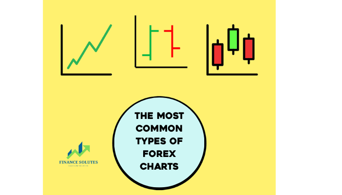
Forex charts come in a variety of forms. However, the most common types of forex charts include only three: line charts, bar charts, and candlestick charts. A typical forex chart represents time on the x-axis and the price of a currency pair on the y-axis. Let’s explore the most popular forex charts and how to read them!
3.1. Line Chart
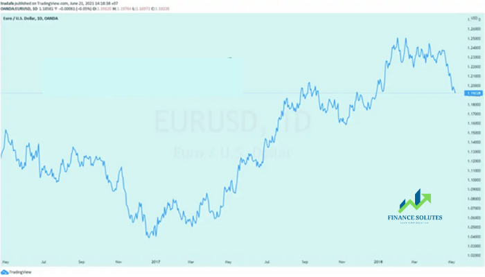
In forex, a line chart is the most basic and straightforward type of price chart. Essentially, it marks various price points of a specific asset on the chart and then connects neighboring points with a continuous line.
- Best suited for trading: Stocks
- Trading experience: Beginners
- Technique used in technical analysis: Offers a comprehensive market overview and helps eliminate price noise
- Advantages: Supports trading without emotional interference
A line chart displays only the closing prices—nothing else. Each closing price is connected to the previous one, forming a continuous and easy-to-follow line.
This type of chart is commonly used on television, in newspapers, and across various web articles because it is simple and very easy to understand. Although it provides less information than candlestick or bar charts, it is better for quickly scanning and getting an overall market view.
Another benefit of line charts is their ability to manage trading emotions by using neutral colors. For example, the blue chart illustrated above. This is because line charts eliminate the “noisy” fluctuations represented in different colors—as seen in bar and candlestick charts.
Pro tip: Line charts only show closing prices. More experienced traders often refer to line charts to plot daily closes or in situations where they want to observe market waves without distraction.
3.2. Bar Chart
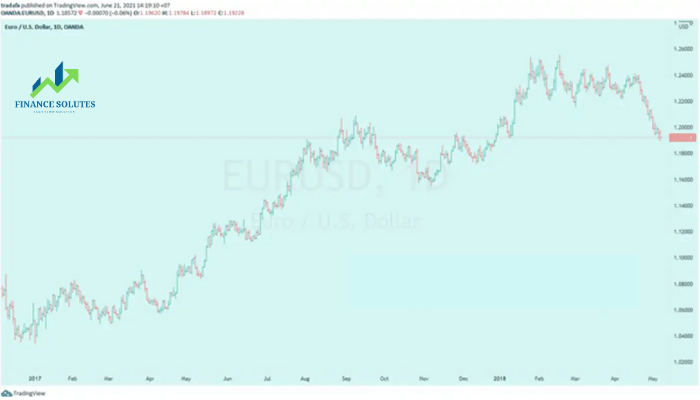
A bar chart, also known as an HLOC chart (High – Low – Open – Close), provides traders with information on the lowest and highest prices, as well as the opening and closing prices.
- Best suited for trading: Forex, stocks, indices, and commodities
- Trading experience: Intermediate
- Technique used in technical analysis: Uses price data (HLOC) to identify trends, support/resistance levels, and entry points
- Advantages: Provides detailed information to identify key price areas and in-depth market data
A bar chart displays the high, low, open, and close prices (HLOC) for each specified timeframe. The vertical line represents the highest and lowest prices of the bar. A small horizontal tick on the left side of the bar indicates the opening price, while the tick on the right indicates the closing price.
This chart can be used to determine whether a bar closed higher (green) or lower (red), helping traders understand market sentiment (bullish or bearish) during that period.
The similarities between this forex chart type and candlestick charts become apparent when they’re viewed side by side; however, bar charts are often better for gaining a clearer market view. By removing bold color fills from the chart, traders can analyze market trends with greater simplicity.
In addition, bar charts are more suitable for displaying a large amount of data compared to candlestick charts. The individual bars are relatively thin, allowing more bars to be displayed at once.
3.3. Candlestick Chart
To overcome the limitations of the previous two chart types, we turn to the Japanese candlestick chart. Originating in Japan, candlestick charts have recently become extremely popular.
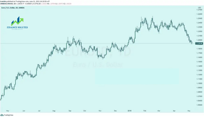
To create a candlestick chart, you need all four price points: open, close, high, and low. While in bar charts, the opening price may sometimes be omitted, candlestick charts always include it.
- Best suited for trading: Forex, stocks, indices, and commodities
- Trading experience: Intermediate
- Technique used in technical analysis: Equivalent to bar chart techniques (depends on trader preference)
- Advantages: Candlestick charts are easier to read for traders due to the more comprehensive nature of candlestick patterns.
Candlestick charts display the high, low, open, and close prices (HLOC) for each specified candlestick timeframe. The “body” of each candlestick shows the opening and closing prices, while the “wicks” (or shadows) represent the highest and lowest prices during that trading period.
The color of each candlestick depends on your software settings, but most charts use green and red as default. A green candle reflects a close higher than the open (commonly called a bullish candle), while a red candle means the close is lower than the open (commonly called a bearish candle).
Candlestick charts are by far the most popular type of chart used in Forex analysis, as they provide traders with more information at a glance.
4. CONCLUSION
Like in other markets, forex charts represent price changes of currency pairs. Instead of relying on complex quote tables, we can simplify things by observing prices through forex charts.
We hope this article has helped you learn how to read forex charts. Additionally, you can explore how to analyze and interpret forex charts for trading with Finance Solutes, as understanding how to read a forex chart is one of the most essential skills in trading.
Wishing you a successful and smooth trading day!
- t.me/finance_solutes
- Website: https://finance-solutes.com
- Hotline: +1 929 5636 439 ( Hotline )
- 26 Broadway, Suite 934, New York, 10004, US
