
 XM
XM Bybit
Bybit Binance
 Robinhood
 Webull
 IC Markets
 Pepperstone
 OKX
OKX Vantage
 VT Markets
 BingX
BingX Gate.io
 Kucoin
 MEXC
MEXC Exness
 Bitget
Knowing how to use and classify different types of Forex charts will help new traders analyze technicals and trade more effectively. In today’s article, FOREX will introduce various Forex charts and which ones should be prioritized for use. Once you have this information, it will be very useful for making sound trading decisions.
What is a Forex Chart?
A Forex chart (also known as a Forex chart) is a visual representation showing the changes in the buy and sell prices of a currency pair, displayed in the form of lines, bars, or other formats. You can observe these price movements across different timeframes: minutes, hours, days, months, or sometimes even years.
A Forex chart displays price movements as follows: the x-axis (horizontal line) represents the time period, which can appear anywhere from the lowest price change data for a currency pair to annual data. The y-axis (vertical line) shows the price of the currency pair.
Function of Forex Charts
Most Forex brokers offer Forex charts as part of their system and can be accessed after traders sign up for a demo or live account. Additionally, Forex charts are also provided by third-party companies for free. A single chart can include multiple formats, allowing investors to easily choose the one that suits their trading needs.
Traders use Forex charts as a method of technical analysis. By using different types of Forex charts, you can analyze the price movements of currency pairs from the past and predict how the prices may trend in the future. Will the price fall sharply, or will it rise even further? Through this, traders can make more informed investment decisions.
Top Forex Charts to Consider for Trading
With the popularity of the Forex market today, we can see a variety of Forex charts. Some of the most common charts include the Bar Chart, Line Chart, Candlestick Chart, and Point and Figure Chart. Each type of chart has its strengths and different uses. For example, it is beneficial to use a variety of chart types instead of focusing on just one.
Bar Chart
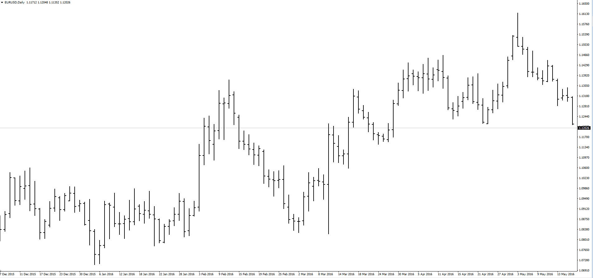
The Bar Chart, also known as the bar chart, consists of a series of price bars. Each bar shows how the price of an asset or security has changed over a specific period. Typically, each bar will show the open, low, high, and close (OHLC) prices, although it can be adjusted to display the low, high, and close prices (HLC).
Strengths
This chart typically provides full, neat, and minimalistic information, making it easy to understand how prices are moving. Additionally, it helps quickly identify trends to draw accurate trend lines.
The bar chart offers a lot of information that is very clear, extremely simple, and easy to understand. This helps us determine the direction in which the price is moving. Moreover, it allows us to immediately recognize trends to draw the correct trend lines.
Weaknesses
The bar chart can be quite difficult to analyze if you are a new trader. Specifically, price action analysis using this chart can be challenging, even though it still provides the four main data points of a candlestick (OHLC: Open-High-Low-Close).
Line Chart
A Line Chart, also known as a line graph, is simply a chart that connects the closing prices from one time period to the next. When these points are connected, you will see an overall view of the price fluctuations of a currency pair at specific points in time.
Strengths
The strength of the Line Chart lies in its simplicity. It offers a straightforward way for beginners to identify trends. The line chart also provides a visual method for timely updates on price fluctuations at specific times. Ultimately, it eliminates almost all noise signals and focuses on the most important element, which is the closing price.
Weaknesses
The simplicity of the line chart can also be a weakness. Because it is quite minimalistic, it lacks detail. Traders may be able to recognize the trend instantly, but they cannot understand how that trend was formed. The highs and lows on the line chart are relatively narrow on shorter timeframes, which does not provide much information about the price. If used incorrectly, it can generate false signals on lower timeframes.
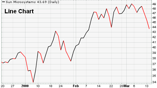
Illustrating with a 4-hour Line Chart, we can only know that the price will close after 4 hours. What we won’t be able to determine is how the price will move up and down during those 4 hours.
The lack of information on the line chart is a disadvantage. You need to stop and carefully observe price retracements, as they are crucial to the success of a trade.
As mentioned above, the Line Chart does not provide enough information about price changes. If using this chart, you must stop and observe the Fibonacci retracement levels. You must be very cautious at this step because it greatly impacts the success of a trade.
Point and Figure Chart (P&F)
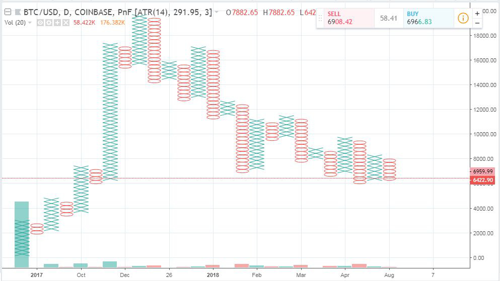
The Point and Figure (P&F) chart, also called the Caro chart, shows price movements of stocks, bonds, commodities, or futures contracts regardless of how much time has passed.
In contrast to other Forex charts, such as candlestick charts, which show the degree of change in an asset over a specific time period, the P&F chart uses columns, such as X or O, stacked on top of each other. Each column represents a specific price change. An X column represents an increase in price, and an O column represents a decrease in price.
The essence of the Caro chart is to set a price unit, which is used to measure price fluctuations expressed on the chart. Moreover, the P&F chart does not display a time axis; it only shows a price axis. Rising stock prices are represented by an X column, and falling stock prices are represented by an O column. These points only form on the chart if the price moves at least one price unit in both directions.
Strengths
The P&F chart is mostly not popular at this time, possibly because only a few traders use it. However, this chart can contrast with the Line Chart and other Forex charts because it provides a lot of useful information. As a result, investors have a rich source of data to perform technical analysis.
Weaknesses
The weakness of this chart is that it is represented by only 2 columns, X and O, so all concepts such as trends, breakout points, price patterns, support, and resistance are also transformed according to these two letters. Sometimes, it brings noise signals and causes confusion when making investment decisions.
Candlestick Chart
The candlestick chart originated from Japan over 100 years before the creation of the bar chart and P&F chart. In the 1700s, a Japanese man named Homma noticed that although there was a relationship between price and supply and demand for rice, it was the sellers who were the true driving force in the market.
Similar to the bar chart, the daily candlestick chart shows the opening price, low, high, and closing price of the market in one day. A candlestick has a wide section called the “body” of the candle.
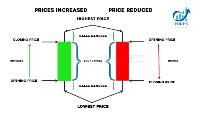
The body of the candlestick represents the price range between the opening price and the closing price of the trade during the day. If the body of the candlestick is colored or black, it means the closing price is lower than the opening price. On the other hand, if the body is of a different color or uncolored, it means the closing price is higher than the opening price.
Strengths
All price information is displayed at once, which allows for the representation of all elements of trends and market sentiment at a given moment. On the other hand, if you trade using the Japanese candlestick method and price action, you need charts that are easy to read.
Weaknesses
Candlestick charts display all price information, including noise and unnecessary adjustments. This can cause confusion when making decisions.
Understanding the Market Profile Chart
The Market Profile chart is a useful tool for both short-term and long-term traders. Typically, this chart is based on price and volume information, combining them by displaying price, volume, and time frame on the same chart. These data points will then show the value range and control points of Forex or securities.
One of the advantages of the Market Profile chart is that it is not time-bound. The formula for Market Profile is as follows:
Price + Time = Value
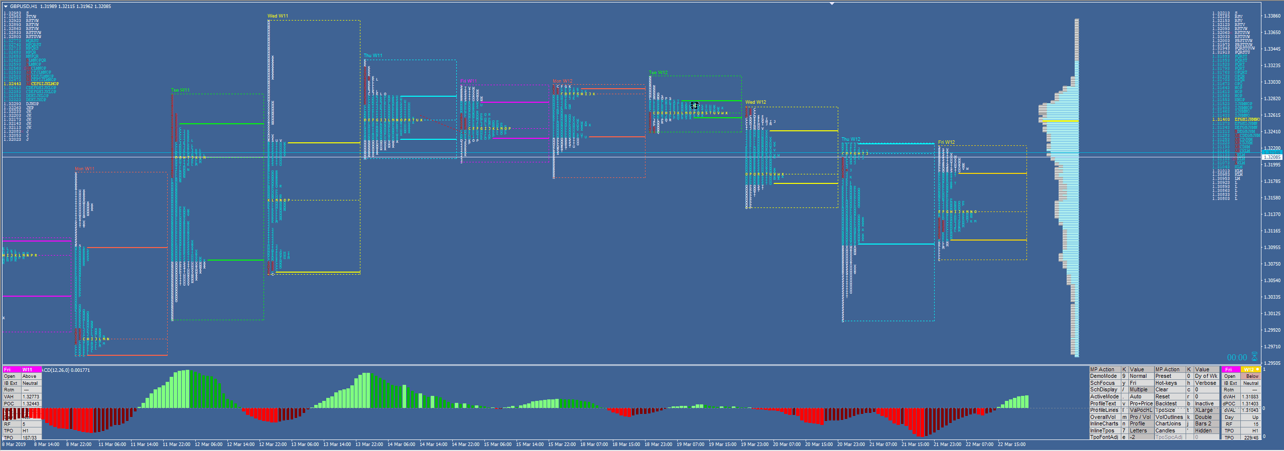
The volume of trading on the Market Profile chart is represented by a horizontal chart, and the longest horizontal line shows the highest trading volume. This price is also known as the point of control because it has the most influence on the market price.
Strengths
When used alone, the Market Profile chart will display price adjustments and form value ranges distributed over time. It also leaves signals indicating how the market is behaving. If you track the development of this chart along with its behavior, you could say that the Market Profile chart is suitable for both short-term and long-term trading.
Weaknesses
The weakness of the Market Profile chart is that it takes time as traders need to adjust the time frame to use it. You need a lot of patience when working with indicators. Additionally, this chart can congest the charts, combining horizontal and vertical lines, making it difficult to view when adding other tools or indicators. Also, you need to consider that it will take a relatively long time to fully understand the essence of the Market Profile.
Types of Forex Charts with Technical Indicators
Forex charts will have customized technical indicators set. Examples include price, volume, and open interest.
If you are a Forex investor, you will need to use these indicators. They were designed to support short-term Price Action analysis.
Here are two basic indicators you need to know:
- Overlays: Similar to moving averages (MA) and Bollinger Bands.
- Oscillators: Similar to Moving Average Convergence Divergence (MACD) or Relative Strength Index (RSI).
Most types of Forex charts will offer you various choices for technical indicators. However, among the wide range of indicators, you need to choose the most suitable one for your trading process.
In some cases, these technical indicators can become a necessary element for an automated trading platform.
A great thing is that these Forex charts offer investors a trial version before deciding to register for an account.
Which Forex Chart Types Are Effective for Traders?
As of now, the most popular chart type in the Forex market is the candlestick chart. The advantage of this chart is that it is more convenient than the bar chart and other charts. The candlestick chart shows detailed price action with specific trading sessions.
For the Line Chart, since it doesn’t provide much information, traders usually don’t prefer this chart type.
As for the Japanese candlestick chart, understanding this chart means you will also understand the importance of the body and the wick in Price Action analysis.
If the candlestick body is green or red and the wicks are two thin lines above and below the body, then in the bar chart, the body and the wicks are separated by extremely small bars. Looking at it comprehensively, it is not easy to differentiate the body and wick of the candlestick. This makes candlestick analysis harder.
The candlestick chart is the only chart used in price action strategies due to its detailed nature and ability to show the best price action. Reversal and continuation patterns are based on the shapes of Japanese candles.
In general, choosing the right Forex chart type depends on what you want to focus on when observing them. The candlestick chart, in particular, provides simplicity, specificity, and presents all important information, making analysis easier.
Moreover, Japanese candlestick patterns are widely used by professional traders, financial websites, articles, and analyses. Therefore, for Forex or stock traders, you should start with Japanese candlestick charts.
Understanding Forex chart types will be the foundation to get closer to advanced analysis techniques, and distinguishing the differences between them will help investors select the most suitable chart. Don’t neglect the basics, as having a strong foundation will make it easier to absorb new knowledge.
Recognizing and distinguishing Forex chart types will help traders get closer to their victories. FOREX hopes you will master this new knowledge and step into a smooth and successful trading phase!
- t.me/finance_solutes
- Website: https://finance-solutes.com
- Hotline: +1 929 5636 439 ( Hotline )
- 26 Broadway, Suite 934, New York, 10004, US
